Brand & Media Resources
A canonical asset set, with the discipline that governs its use. Official DiligencePilot logos, marks, social images, print variants and brand reference — for partner, media and campaign use.
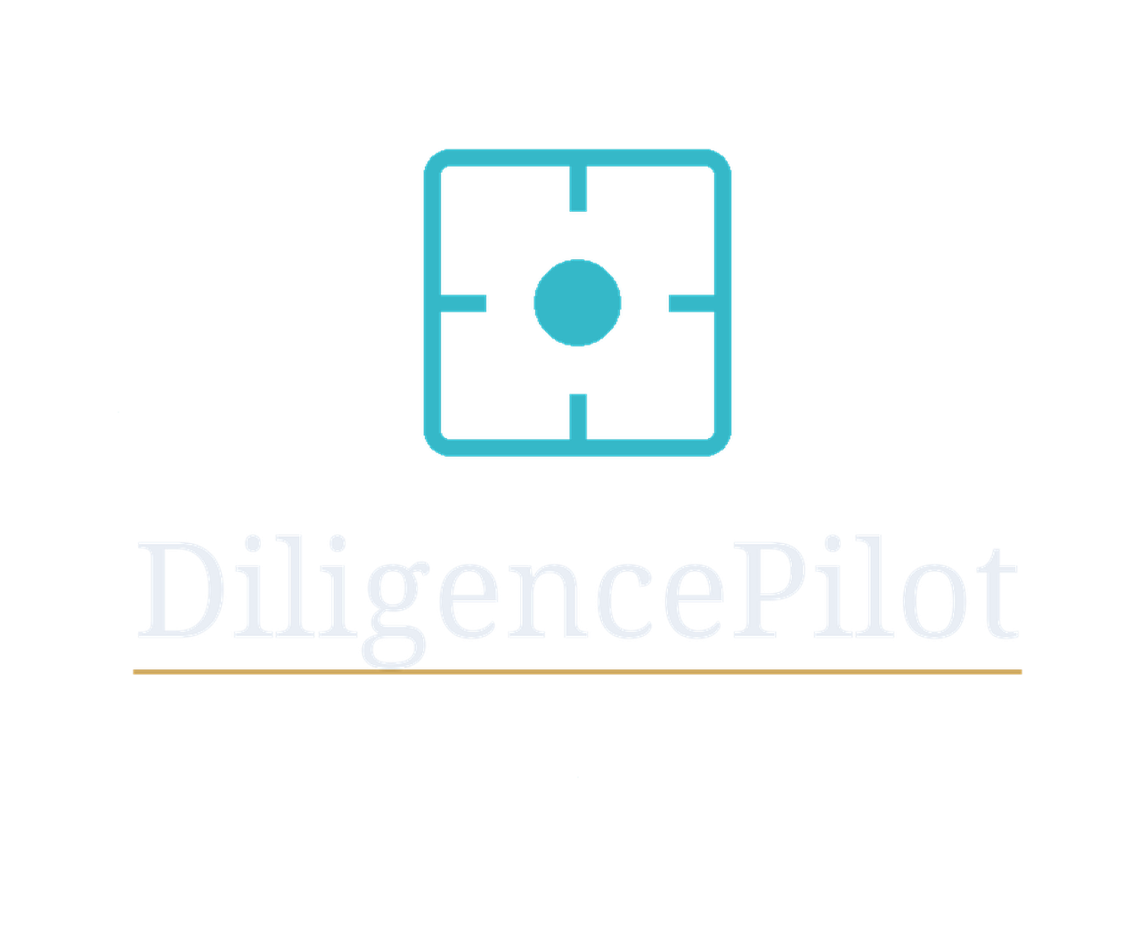
The official logo family.
Site-native identity, no decorative effects. Every variant derives from the canonical brand mark — a cyan decision-frame reticle with a centred decision point.
Brand mark
The site-native cyan reticle. Use as favicon, app icon, social profile photo or where the mark stands alone.
Horizontal logo
Full lockup with brand mark + DiligencePilot wordmark. For presentations, partner kits, document headers.
Compact horizontal logo
Tighter proportion for narrow header strips, partner sidebars, email signatures.
Stacked logo
Mark above wordmark — for square ad slots, narrow columns, mobile splash screens.

Wordmark only
"DiligencePilot" type-set without the mark. Use when the brand mark is shown separately or visually unnecessary.
Monochrome — white
For dark photographic backgrounds, partner co-branding, watermarks. Mark + horizontal logo + wordmark variants.

Monochrome — black
For white backgrounds, formal letterhead, single-colour print, fax / legal documents.
Favicon & app icons
Browser tab, mobile home screen, Windows Tile, PWA. Full set including maskable variants for adaptive Android icons.

Email signature
Light and ink versions, each 200w (1×) and 400w (2× retina), for email signatures. Light for dark blocks; ink for white/light email bodies. Renders cleanly across major email clients.
For broad and premium placements.
A typographic accent — a thin restrained gold rule beneath the wordmark — that reads as institutional polish in large surfaces. Use these in brand kits, presentations, large banners, social covers, partner kits and PDF deliverables. Do not use for UI, header or small placements; for those, the Minimal set above is correct.
Horizontal logo — Refined
Full lockup with thin gold accent rule. For brand kit, presentation covers, large banners (≥970 wide), partner co-branding.
Stacked logo — Refined
Mark above wordmark with gold accent rule. For square ad slots ≥600 wide, vertical formats, document covers.
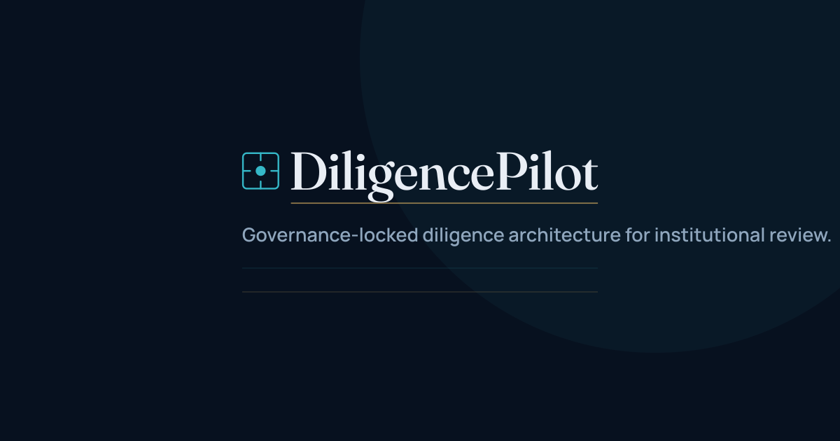
Social/OG with descriptor
Open Graph share image with the context line "Governance-locked diligence architecture for institutional review." — descriptor is layout copy, not a logo tagline.
Share cards and social profile assets.
Native sizes for the major social platforms. Use the OG image as the default share preview; the profile assets cover Twitter/X, LinkedIn and generic square profiles.

Open Graph share
1200×630 — the standard size for Facebook, LinkedIn, generic share cards and Slack unfurl.

Twitter / X card
1200×600 — Twitter / X large summary image. Renders as the inline preview on X.

Social profile icon
512×512 square brand mark, for use as profile photo on Twitter/X, LinkedIn, Slack, Discord, GitHub.
Palette, typography and usage minimums.
Palette
#07111F
Primary surface · institutional ground
#35B8C8
Brand mark · accent · alignment traces
#C9A45C
Decision-point highlight · governance accent
#E9EEF5
Wordmark · headings on navy
Typography stack
Three families work together — display serif, body sans, technical mono. None substituted in brand applications.
Fraunces
Display serif — page-head h1, italic accent moments
From fragmented signals…
Manrope
Body sans — wordmark, headings, lead text, body
DiligencePilot
JetBrains Mono
Technical mono — eyebrows, codes, identifiers
KR-1 · M03 · C-007
Minimum sizes
Brand mark only: 22 px digital · 8 mm print
Compact horizontal: 160 px digital · 24 mm print
Full horizontal: 220 px digital · 32 mm print
Stacked: 140 px digital · 22 mm print
Wordmark only: 140 px digital · 22 mm print
Below these sizes use the brand mark alone — the wordmark and lockup elements lose legibility.
Clearspace
Allow a clear margin around the logo equal to the height of the brand mark itself. Never crowd against text, image edges or other graphic elements. For monochrome treatments on photographic backgrounds, also ensure sufficient contrast.
If in doubt, leave more breathing room.
Display, social, video, email and print-ready placements.
The official campaign banner library is live — 46 ready-to-use banners across display (970×250 to 320×50), paid & organic social (Meta, LinkedIn, X), open-graph share cards, YouTube covers, email hero banners, web hero strips, mobile and digital-screen formats, and print-ready A4 posters. Every size is built on the governance-locked v9.1.11 logo system and ships as a PNG master plus an optimised WebP.
Browse the full library to preview each banner, see native dimensions and intended use, download PNG or WebP, copy a ready-made embed snippet, and review usage terms.
One-tap kits.
Full asset bundles, ready for immediate use.
Minimal Logo Kit
Mark + wordmark only, no decorative elements. Use for UI, header, favicons, small banners, narrow placements.
Refined Logo Kit
Same lockups with thin gold accent rule + descriptor-bearing social/OG assets. For brand kit, presentations, large banners, social covers, partner kits.
Full Brand Kit
Everything — both Minimal and Refined sets, all SVG masters, every PNG size, monochrome variants, favicons, social, print, README. The complete canonical library.
Banner Library Kit (all 46)
Every campaign banner — display, paid & organic social, web hero, OG & video covers, email, cards, mobile, digital-screen and print-ready A4. PNG masters + optimised WebP, organised by family, with a manifest.
Usage at a glance
Use Minimal for: UI, site header, favicons, small ads (≤300×250), mobile banners, narrow strips, partner sidebars.
Use Refined for: brand kit deliverables, presentations, PDF reports, large banners (≥970 wide), social covers, OG/share, sponsor kits, premium placements.
What to do — and what never to do.
Do
- Use SVG where possible — clean at any zoom level
- Preserve the clearspace minimum
- Use the monochrome white variant on dark photographic backgrounds
- Use the monochrome black variant on white documents and letterhead
- Use the compact horizontal logo in narrow strips and header areas
- Download from this page — these are the canonical files
- Maintain contrast — if a background is busy, switch to a monochrome variant
Don't
- Recolor the brand mark — only the listed monochrome variants are permitted
- Rotate, skew or stretch the logo
- Add a gold ring, gradient, glow, drop shadow or any decorative effect
- Add descriptors, taglines, underlines or secondary text to the logo lockup — use the logo as provided (“DiligencePilot” only). Terms such as “Decision Intelligence” or “Institutional Decision Intelligence” may be used in body copy, headlines or campaign text when contextually appropriate, but never as part of the logo.
- Recreate the mark manually — use the supplied vector files
- Place the full-colour logo on a busy or colourful background without contrast — use a monochrome variant
- Use a screenshot of the live site header in lieu of these official files